The new Gameforge Portal - Feedback thread

This site uses cookies. By continuing to browse this site, you are agreeing to our Cookie Policy.

  • I understand that helping to test this server (Bermuda) demands felxibility in accessability.

    What I don't understand is that I cannot access the game for two days and when I can access it again I see 13(!) combat reports! Aparantly you forgot to exclude one player (tuvieja) from the game, who completely wrecked me.

    I hope you understand my annoyance and will help me get full compensation by this player.

  • JoKy wrote:

    crusy wrote:

    One thing I am missing in the FAQ (or did I oversee it?)

    Assume I have two Portal Accounts for my two games (or 2 OGame unis) using separate Email addresses. Can I play both games at the same time? Or will the cookies not be compatible, so that I can not log in on the portal multiple times in the same browser?


    Nothing changed on OGame side. One Account per Browser on one server

    LG


    I don't think you understand what I am saying. I have logged onto ogame-live.gameforge.com The problem is I can now not create a second login there as if I open a new browser tab with that adress I am automatically logged in there. So if, like someone already posted, I want to let someone sit my account I have to give them my Portal account! From there he can then log in to all my unis! If I could actually have multiple portal accounts open simultaneously this would not be a problem. Are we really forced to log in to Bermuda via this new Portal? When this goes live will this be the only place to log in?
  • crusy wrote:

    JoKy wrote:

    crusy wrote:

    One thing I am missing in the FAQ (or did I oversee it?)

    Assume I have two Portal Accounts for my two games (or 2 OGame unis) using separate Email addresses. Can I play both games at the same time? Or will the cookies not be compatible, so that I can not log in on the portal multiple times in the same browser?


    Nothing changed on OGame side. One Account per Browser on one server

    LG


    I don't think you understand what I am saying. I have logged onto ogame-live.gameforge.com The problem is I can now not create a second login there as if I open a new browser tab with that adress I am automatically logged in there. So if, like someone already posted, I want to let someone sit my account I have to give them my Portal account! From there he can then log in to all my unis! If I could actually have multiple portal accounts open simultaneously this would not be a problem. Are we really forced to log in to Bermuda via this new Portal? When this goes live will this be the only place to log in?


    That´s the only way to login yes.

    For your "Problem" you can be logged in in 2 different portal accounts, same as for ogame, use 2 different browsers.

    LG
    Being a QA is sort of like being a goal keeper. People only talk about you when you’ve screwed up. We are the silent guardians of game development, and they will never have to thank us.
  • JoKy wrote:

    crusy wrote:

    So if, like someone already posted, I want to let someone sit my account I have to give them my Portal account! From there he can then log in to all my unis!
    For your "Problem" you can be logged in in 2 different portal accounts, same as for ogame, use 2 different browsers.
    What sense does it make creating a portal to on one hand make possible access to different ogame accounts, and on the other hand it is necessary creating one portal account for every game account just because someday it could be necessary someone sits one of the game accounts?


    Two things I noticed:

    - I changed language to German in the portal, I logged in the game, I quit, and then the portal (in the tab where the game opened) was in English.

    - Maybe it wasn't already anymore there before in Origin, but on the 'normal' server it is possible to delete a game account going on 'options' - 'extended' - 'your account', but now here I don't see anywhere how I can delete a game account!?


    € And two more things:

    - Being the zoom on 100%, it is necessary to scoll down before I can log in a game account - if it is on 50% I don't have to scoll, but the field to select the universe and the name of the universe are so small, that it is quite difficult to read.

    - Is it possible to deactivate the video? - Maybe nice to see once, but I really don't need it everytime... :crazy:
  • Now I learned that all the informations that I have received from you are wrong.

    you don't have to create a new Gameforge Account if you have allready a gameforge account - that's WRONG! for Origin I had to create a new one for this new portal thing

    all your account will be merged if you have a gameforge account - WRONG! I can't merge anything with my old gameforge account.
    Can I possible merge the other games in the new one or is it still impossible because the new portal thing is not available for the other games

    So - please consider the correct answer now - before it's wrong again
    Is it possible that I can all games from my "old" gameforge account (with all german games in there) connect with that new portal gaeforge account

    OR will the both gameforge accounts merge together if the portal comes for all games

    OR will I have forerver two accounts because I have two difficult countryserver (United Kingdom and Germany)
  • Crash the new portal is just for pioneers and isn't connected to anything else. Also on the old portal you couldn't choose the pioneers universes.
    This will work when the new portal releases for the OGame live servers, but not now (you also wouldn't want that now, trust me).

    @ Lunati: My Games -> click the gamelogo -> Delete game account

    Origin Admin
    OGame-Tech Chief
  • The new Gameforge Portal - Feedback thread
    Dear players,

    Here you can discuss, give feedback , ask questions on the new Gameforge Portal, soon to be tested and implemented

    See the announcement here:
    Important: OGame is heading to the new Gameforge Portal soon and you can test it!

    List of things already metioned:
    Polishingwishes:

    Create a way to sit one specific account, not the whole portal account
    Multiple portal accs in one browser session (see point above to circumvent this problem)
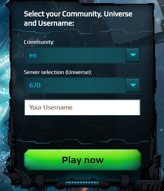
    Remove the need to scroll down to log in
    Make it possible to deactivate the videobackground


    Bugs:

    The portal language gets set back to serverlanguage when you log out ingame
    Multiple things with the account creation overlay
    Videos are in german altough page is set to english


    Positive things:

    All accounts in one place
    Finally more secure passwords possible


    Negative things (also see polishingwishes):

    Stitting only possible for the whole portal acc
    Annoying backgroundvideo
    Takes long to get to the gameloginbutton


    Hello...
    I have my doubts with the portal ... much do not like, at the beginning is a little difficult to find where to go

    I am of users who use the portal xx.gameforge.com/home/index (xx refers to the country, us, mx, es)

    This new portal will only ogame? or also served for other games gameforge?

    I'm not convinced the new portal ... it is very heavy graphically.
    It is not as accessible.

    if gameforge had a portal, which when entering the web gameforge.com/mymmo/index
    automatically it gives me access to all of my accounts ogame (fr, es, ar) , Mettin 2 and other ...

    with one click, I can enter each of my accounts ogame.

    this new portal, has basically almost the same idea as above

    The positive:
    It can be something cute, but heavy graphics ...
    I will continue reviewing the new portal, you may find something else ...

    Negatives: (compared to portal that normally use)
    It would not be if your account up or under
    not see the ranking of your accounts
    Show more information missing


    for now the only new, besides the graphics and presentation, it is that tells you the last time you went to the account.

    this would translate to translate.google.com
  • NoMoreAngel wrote:

    Crash the new portal is just for pioneers and isn't connected to anything else. Also on the old portal you couldn't choose the pioneers universes.
    This will work when the new portal releases for the OGame live servers, but not now (you also wouldn't want that now, trust me).

    @ Lunati: My Games -> click the gamelogo -> Delete game account
    Thanks NoMoreAngel
  • So far forwarded from my side:

    Mobile > Horrible and on iOS not usable
    Mobile > data consumption is too high
    Problems with the only way to login is having the primary e-mail (OGame Users are not used to login with mail only and if you forgot it after you merged you are doomed)
    Get a mail after you merged your account
    About the video: that will be changed :)
    Sitting: yeah it´s a problem, because you have to give away your whole portal account, we also will forward that part.

    We also forward usability Problems e.g. too many klicks to get into ogame and also with long loading time on the way

    For all: Thx for the feedback so far. NoMoreAngel and me are collecting your feedback HERE and forwarding it directly to the Portal team, so continue testing and note down your problems or the positive things you find out.

    @JavierKbSa
    About password security: you can change the password of the portal account

    LG
    Being a QA is sort of like being a goal keeper. People only talk about you when you’ve screwed up. We are the silent guardians of game development, and they will never have to thank us.
  • NoMoreAngel wrote:

    @ Lunati: My Games -> click the gamelogo -> Delete game account
    Thanks! :)
    I didn't have the idea to click there before, thought it was only information about OGame in general.
    I got to the OGame Account in two other ways: by clicking 'Account overview' - 'last played' or, after having logged out the game again, scrolling down to the field where it says 'Game accounts' - server xy - 'play now' (that's what I meant with having to scoll/name of the universe small using the zoom)

    Something very strange: As I already mentioned, I changed language to German in the portal, I logged in the game, I quit, and then the portal (in the tab where the game opened) was in English. But as I had changed language again to English, logged in the game and out again, the tab of the portal was partially in English and partially in German :crazy:
  • I really dislike this portal.
    And not just from the "I dislike it because it is just another messy idea forced upon us by GF management" aspect.

    It is far more annoying then "modern" or fancy.

    All accounts in one place.. IMO just makes it easier for hackers to steal/trash ALL accounts from a player, instead of just one.
    How much support will GF give players that lose everything because of this portal?

    Fairly high CPU / Memory usage from firefox (46.0.1) from the new portal page (that, and maybe .org forum were the only page loaded).

    That's with all addons disabled and none of the other tabs I usually have loading yet.
    It drops back down to normal CPU usage (approx 4/5%) once the new portal page is closed.


    I hate to think how much extra data this would swallow up on a mobile device, or those with a data allowance.. just in the few moments people needed it on so they can log in at.


    It doesn't matter how fancy it is, if the attempts to make it "attractive" just make it slower to log in, it'll just turn even more people away. Functionality >> Aesthetics.
    Remember K.I.S.S. Keep It Simple, Stupid.

    I, like a lot of the older players don't care about all these fancy graphics or stupid auto playing videos, hell I don't even care about any of GF's other games any more.
    I just want a quick and easy way to log in to my game accounts while I still have them.
    Hell, give us the choice of just a white page with just the 5 choices (like the old emergency login).
    Game, Language, Server, then the user name and password fields.
    And I'm sure most experienced players would happily chose that over this mess of unnecessary graphics.
  • Why does the new portal take so log to load? The old Ogame login page takes 2 seconds to load, and you can log in before the page finishes loading. The Gameforge portal takes 8 SECONDS to load, even with scripts disabled and with most of the image and video elements disable. The page also does not display until the portal is finished loading, meaning you can not log in before the page finishes loading.

    It's one thing for the page to be slow to load since there are so many elements in it, but I STRONGLY DISLIKE the fact that the page does not display until the whole page is finished loading. Let players log in to their preferred game as soon as possible rather than forcing them to wait for the whole page to load. I'm guessing part of the reason it takes so long and uses so much bandwidth to load is because you are forcing the users to pre-load the videos on the bottom of the page. I really don't like that aspect because it seems to be one of the contributing reasons that the page takes a long time to load. I'm not sure what else it could be that's causing the long load times but you guys really need to look into that. Compare your portal page loading with other gaming companies:

    us.blizzard.com/en-us/
    nexon.net/
    ea.com/
    store.steampowered.com/
    arcgames.com/en/games/

    Even more specifically, pages that are similar in style to yours:

    bladeandsoul.com/en/
    vindictus.nexon.net/
    na.finalfantasyxiv.com/
    blackdesertonline.com/game/
    eveonline.com/

    There's a huge difference in the load times between the Gameforge portal and the listed pages, with the exception of eveonline's page. There is also another huge difference between the Gameforge Portal and these other pages. All these other games have their own game launcher separate from the portal. Theoretically, they could load up their page with as much graphical content as they want because the page will pretty much only be viewed by potential new customers. Their current player base will be looking at the game launchers instead. In Gameforge's case, you are forcing both the current client base and potential new customers to look at the same page. Please keep this in mind when designing the portal page.

    Also, I really hope there's a mobile version of this portal page. Given the prevalence of mobile usage in current times, it is highly likely that most of your customer base will be using their mobile devices to login to these games. Forcing your clients to use up so much bandwidth and time just to log in will strongly discourage your current userbase from playing more frequently and will also STRONGLY DISCOURAGE potential new players from trying your games due to the hassle of simply logging in.

    The color palette and design of the portal is very nice. It looks very modern and clean and is aesthetically pleasing and looks a bit more safe for work compared to the gaudy Ogame login page right now. Good job on that. But please work on optimizing the page so that it loads faster, let the loaded elements of the page display before the page is finished loading and don't make the page preload videos.

    For other players:

    I find that logging in via this page: account.gameforge.com/#/en_GB/overview/games
    cuts down my average loading time from 8 seconds to 6 seconds. It also displays some elements of the page before the entire page finishes loading and has less media content so it seems easier on mobiles. However, it does force you to click on the Ogame image first then you have to click play now on the appropriate galaxy whereas you only need to click once on the portal page if the correct galaxy is already selected in the dropdown box. It also does not load the Ogame image you need to click until the entire page finishes loading. Both pages are a downgrade when it comes to logging in as quickly as possible.
  • Some of the most annoying issues have already been mentioned here. Thanks for the quick disabling of the autorun videos. Whoever thought them a good idea should be forced to watch them 1.000 times in a row on a mobile device with exhausted download volume and with reduced download speed. And then again.

    The clustering of all game accounts protected by only one password is maybe convenient, but dangerous. A few years ago the login sites were changed to prevent multiple login selections by user scripts. AFAIK for safety reasons. Now users will have to create multiple portal accounts with different EMails if they want the same lvl of security. Such forced behaviour makes gaming less attractive. Exposing all accs to a sitter is a no-go.

    If you think the (fancy but useless) pictures necessary make them foldable, i.e. like ingame the ally page. So the Login Buttons would be displayed at the top of the page. Reduces scrolling.

    Drop down menu of game accs: Why drop down? Forces more scrolling. Why not display the buttons horizontally? Makes the selection easier, especially for smartphones.

    "Play Now" button: Why do I have to confirm my selection with another klick? I already selected an acc for playing. "Are you sure?" "You bet I am!" Would be nice if you could link some accs together, too, so you could select a parallel login.

    It has already been stressed, but I'd like to repeat it: people who already play their favourite game(s) want a login wtihout (or with an absolute minimum of) delay or fuss. If you want to keep them happy, don't make it complicated for them.

    kfg
  • Meanwhile I have received two E-Mails allegedly from Gameforge concerning the start of the new portal, the first one on 3rd of June, the second on 8th of July. In one of them, in the subject (in German) it says that the Gameforge portal is coming at the end of June, and in the other one now it says end of July. The content of the E-Mails (in English) is nearly the same (links in them are slightly different (but I didn't click)) - it says it is coming at the end of June.
    In the forum I did not read anything about when the new portal is coming...
    Are these E-Mails really from Gameforge?
    The E-Mail addresses weren't the same: gameforge_mmo at gameforge com and gameforge at news gameforge com