"fl00ri" wrote:
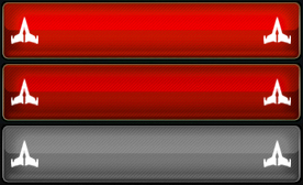
Because the capacitybar isnt shown in full length the concept in the 2nd post cant be used now... So i reworked the send fleet button and modified it to also show the mission. Ofc i can change some things like the icon size/color etc, if you wish - just tell me.
Note that the point of using this button is to have a final clear button (that also provides sending info) still in OGame-style. All buttons appearing before are equipped with tiny mission-icons etc. This final clear button intends no more ongoing settings (end step)
The color shows the load status as the following:
red - nothing loaded
green - enough capacity, full loaded (or needed amount)
teal - enough capacity, a bit loaded
orange - not enough capacity, full loaded
yellow - not enough capacity, a bit loaded
original button
expedition button
colonization button
harvest button
transport button
deployment button
espionage button
acs defend button
attack button
acs attack button
destroy button
clean button:

"fl00ri" wrote:
[this is a not useable concept. just stored for a possible ogame patch]
pls go to the 1st post
Capacity Bar:
[original - fleet], [original - rockets], [original - box]
highlight colors for the kind of loading in the following ways:
1)not enough ships for all res
a) nothing loaded = red only →
(e.g. just empty cargobay)
b) a bit loaded = yellow only →
(e.g. only a part from 'missing resources' calculator sending loaded)
c) all loaded = green only →
(e.g. all 'missing resources' calculator sending loaded)
2)enough ships for all res:
a) nothing loaded = red only →
(e.g. just empty cargobay)
b) a bit loaded = red+yellow →
(e.g. only a part from res with full fleet loaded)
c) full loaded = red+yellow+green →
(e.g. all res with full fleet loaded)
(each bar should have its own tooltip for explanation)
additionaly a bigger box is needed:
example:
p.s. the highlighted part of the capacity bar can be animated. because the uploader stores the animation only for a short time I wont show it here, but i will provide them in the zip-file.
note: Francolino is redesigning the whole fleetdispatch page III → see here. By changing the order of the resource boxes and loading buttons there will be enough space to use this concept.


