game playability and usability

    • Usability

    This site uses cookies. By continuing to browse this site, you are agreeing to our Cookie Policy.

    • game playability and usability

      First I want to stress that the features introduced by version 3 and 4 are extremely necessary to ensure the game survival and to give players the best possible game experience and bring the game up to date, to the level of other games on the market.

      Now that we have so many powerful and interesting new feature ( here is not the place to discuss about them), I think is time to think how to make game more easy to play, how can we simplify it . What I'm more interested is to discover things we can live (i mean play) without.There are a lot of minor things that are not strictly necessary to gameplay.

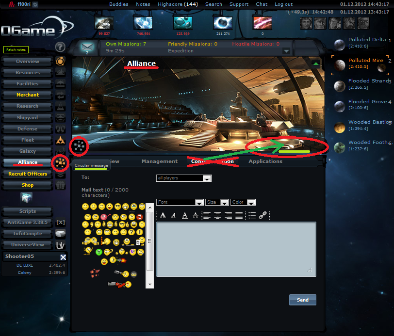
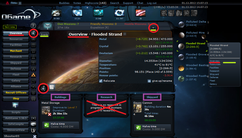
      I'm looking to the suggestion thread and i see only things to be added . If we don't stop in time, ogame can become something shining and overdecorated but unplayable.

      I'm asking you all, what are your thoughts regarding playability and usability ?
    • One thing i'd like simplified is the fleet menu , maybe have all the settings organised in a logic way in the same page
      Second is the resource settings page. I see no utility for it , I propose to be condensed in the main resource page. Many players are not aware of the tiny link in the central picture and fail to restart production after vacation mode
      Another is to reduce the number of tooltips , especially the ones that are simply repeating the name of the button- maybe an option to enable or disable them.

      Now, i'm aware that this can make the page be a little too cluttered , loaded with information and some important things can be left out by a less attentive player. But maybe skill and attention should be encouraged instead of laborious clicking through pages
    • Hello,

      I agree with Valents Idea, that we should make the game more comfortable in general and give new users a easier way to explore all features of OGame (and there are a lot of new Features, since I started with OGame 2003).

      IMHO this needs complete re-think of some GUI elements and dialogs. One good Example are the small icons right of the menu items. Some are decoration, some are useful... And I'm sure there are a bunch of other little things we could improve to help new players getting started.

      Another relevant point for me is accessibility ("freedom from barriers"). Before the RD OGame was easily playable with Screenreaders and other tools. I found that was great. Because everyone should be able to play.
    • If we have some interesting suggestions to improve the GUI we will change / add them.

      New tutorial is on the list. Fleet menu is in mind but still don't have a final solution of how to change it (like fleet on 2 pages instead of 3). Res settings...why not. Res after vmode should change theirself again. Less tooltips is on the to do list.
      - - - WTH was here - - -

      PD

      ogame has no bugs...only unbalanced features^^
      yeah my girlfriend too :P
      loool
    • hi there,
      I have some suggestions to improve the playability

      1) Menus/sections:
      Each section in the menu have a icon for a subsection.
      So I suggest to fill up every subsection (if possible) and create a link to go there in each of those icons and in the image of the section, too.
      This has been done well for 'Resources' and 'Fleet movement', but can be
      improved and should be introduced for all other sections.

      Everyone should handle the menus intuitivly! in different ways. Therefore there could be a tooltip-menu for every planet, like →this script (but it should also show the subsections).

      Display Spoiler
      Resources:

      - red line shows section (current position)
      - red circle should be links to the subsection
      - area with red X should be removed (resource settings should be in subsection only, and not in section resources too. it is also not complete and i think the most changes there have to be done with the fusion reactor that is not listed there!)


      Display Spoiler
      Alliance

      - deletet the tab 'communication' and create the button 'circular message' in the image instead.


      Display Spoiler
      Research


      2) Overview

      Another change could be done in the 'Overview' at the queue-lists. improve the headlines and link them to the corresponding section:
      Display Spoiler

      - remove the hint that nothing is in progress, that's trivial/obvious
      - instead link the headlines to the section, so you can go there although there is something in progress
      - rename the purple boxes: Buildings = Buildings | Facilities , Research = Research , Shipyard = Shipyard | Defense


      3) Subsections
      i was talking about filling up the subsections. Now some suggestions:
      Display Spoiler
      'Recruit Officers' subsection can be: 'Purchase Dark Matter'
      it would be faster/easier to enter coupon-codes and earn/buy DM

      'Galaxy' subsection can be: 'Logbook'

      It's working like →this script, but is improved:
      If you click the icon, there is the logbook menu with its settings:
      - set up to 5 different coordinates for observation
      - see the coordinate where you have been the last time (If you must do a short break because you ran out of fleet slots while spying around you, then you can easily go back to the latest system and go on spying)
      -something for the future, e.g. a tab for expedition logbook, a tab for combat logbook
      latest position (green) and observation coords (grey) should be shown in the tooltip of the icon as links (and in different colors).

      'Facilities' subsection can be: 'Missile Silo'. Maybe someone has better ideas...

      So only the subsections from 'Shipyard' and 'Defense' are missing.
      If it is planned to implement a combat-calculator, then there would be space for it (Shipyard and Defens together).


      Summary/comment
      As you see, I focused on a complete and logical structure to navigate through the menus more intuitivly. If that is given, then some hints/tooltips/copied incomplete resource settings/etc. can be removed for a better overview (simplify). Furthermore it would be easier/faster to navigate to any wanted section/subsection and to get needed information. But there is still space to introduce some new features. I hope you like it :D

      GreetingZ
    • Упрощать не нужно. Старшие по топу будут очень разочарованы, играть будет не интересно. А вот немного флеш-анимации для разнообразия добавить стоит.
      21 век, а Ogame больше похож на документ microsoft offis. Ведь это космическая стратегия, а простейшей флеш динамики игры нет.
      Для конкурса было очень мало времени чтоб подготовить какой-нибудь проект редизайна.
      ______________________________________________________________________________________________________________________________

      Simplify do not need to. Senior at the top will be very disappointed, play will be not interesting. And here's a bit of a flash animation for diversity need to add.
      21, and Ogame more like a microsoft offis. After all, this is a space strategy, and the simplest flash dynamics of the game there.
      For the competition had very little time to prepare any project redesign.