OgDroid (Ogame client for Android)

    • What are you talking about marshen?
      The app and the google code page are full english, no?
      I don't understand....

      Edit : I see what you mean: variables and methods are all french named... I don't know if I'll correct that, but I surely go on with english names, now... Sorry for that...
      I'll maybe change some names here and there sometimes but I can't garantee I'll be less lazy... ;)
    • First of all: Really, really awesome app! I was really disturbed of using the browser everytime for playing my favorite game :)

      Some comments, which may be help you with developing :)

      I'm using HTC Desire with Android 2.2
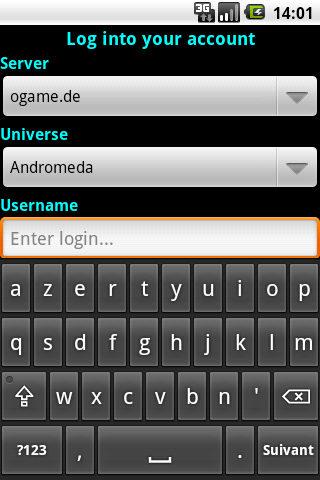
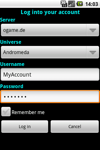
      • I filled in my server, universe and username at the "Log into your account" window. At that point, I had to scroll down to fill in my password (because my keyboard blocked it). Unfortunately, scrolling down was impossible, so I had to hide my keyboard and click the password box. It's a small beauty-comment ;) Same for the "Remember me" checkbox.
      • Is it right, that almost all the "menu items" have got the default android thumbnail?
      • At some points, there poppud up a "Finish action with.." -mail -gmail screen. I thought that was a really annoying bug, but it is the bug report function. Very nice, but maybe you can make this more clear? At least you'll get some e-mails from me, now ;)
      • "Galaxy" screen: When I want to fill in the 2:XXX, my keyboard popups and I'm not able to see the X.XXX fields anymore. I'm only able to see them if I hide my keyboard again.
      • I am not able to see Galaxies. I've sent you a mail about it ;)
      • When I was at the Galaxy screen, then switched to another planet, I was getting the "unfortunately has stopped unexpected" error. :(
      • Main screen: "Flotte" has to be translated to "Fleet"?
      • If you want, I can help you with translating to Dutch :)
      All these bullets are to help you, because I really love this project!
      Thanks, man!

      Potentiel00s
    • Hi Potentiel00s!

      First thanks a lot for your test and your feedback!

      I'm going to answer you the best way I can... :)

      Display Spoiler

      potentiel00s wrote:

      I filled in my server, universe and username at the "Log into your account" window. At that point, I had to scroll down to fill in my password (because my keyboard blocked it). Unfortunately, scrolling down was impossible, so I had to hide my keyboard and click the password box. It's a small beauty-comment ;) Same for the "Remember me" checkbox.

      You're right, I'm going to fix it quickly. What about including a "Next" button inside the keyboard? You wouldn't have to scroll anymore.. Just click on the button for the cursor to move automatically to the next text editor... What do you think?

      potentiel00s wrote:

      Is it right, that almost all the "menu items" have got the default android thumbnail?

      You should see 2 icons (a money bag and a test tub...). These are only test and temporary icons. I'm no designer and looking for a nice people to design me some... XD But there's no bug here... It's "normal"... ;)

      potentiel00s wrote:

      At some points, there poppud up a "Finish action with.." -mail -gmail screen. I thought that was a really annoying bug, but it is the bug report function. Very nice, but maybe you can make this more clear? At least you'll get some e-mails from me, now ;)

      I'll take a look at this.

      potentiel00s wrote:

      "Galaxy" screen: When I want to fill in the 2:XXX, my keyboard popups and I'm not able to see the X.XXX fields anymore. I'm only able to see them if I hide my keyboard again.

      Hum... Ergonomy may not be adapted enough. I'll try to improve that to a better way.

      potentiel00s wrote:

      I am not able to see Galaxies. I've sent you a mail about it ;)

      I'm actually working on it... It's not fully implemented yet...

      potentiel00s wrote:

      When I was at the Galaxy screen, then switched to another planet, I was getting the "unfortunately has stopped unexpected" error. :(

      It may come from the same reason

      potentiel00s wrote:

      Main screen: "Flotte" has to be translated to "Fleet"?

      A forgotten one! Thanks! XD

      potentiel00s wrote:

      If you want, I can help you with translating to Dutch :)

      I'm really interested, sure! But I have to finish the app first. All strings are stocked in xml files, for internationalisation. But if I start asking now, xml are going to change very often...


      May I ask you to report bugs on the google code page?

      Thanks again for this report. It's going to help me so much!
    • kricek wrote:

      potentiel00s wrote:

      I filled in my server, universe and username at the "Log into your account" window. At that point, I had to scroll down to fill in my password (because my keyboard blocked it). Unfortunately, scrolling down was impossible, so I had to hide my keyboard and click the password box. It's a small beauty-comment ;) Same for the "Remember me" checkbox.
      You're right, I'm going to fix it quickly. What about including a "Next" button inside the keyboard? You wouldn't have to scroll anymore.. Just click on the button for the cursor to move automatically to the next text editor... What do you think?

      ~ In that way, you have to change/redesign to whole keyboard.. I don't think that's a good idea. Maybe it's an idea to make the page a bit longer, so users are simply allowed to scroll down.

      potentiel00s wrote:

      Is it right, that almost all the "menu items" have got the default android thumbnail?
      You should see 2 icons (a money bag and a test tub...). These are only test and temporary icons. I'm no designer and looking for a nice people to design me some... XD But there's no bug here... It's "normal"... ;)

      ~That's what I thought ;) I'm not a pro in Photoshop, sorry...

      potentiel00s wrote:

      If you want, I can help you with translating to Dutch :)
      I'm really interested, sure! But I have to finish the app first. All strings are stocked in xml files, for internationalisation. But if I start asking now, xml are going to change very often...

      ~ I understand. If you think the app is ready, you can send me an e-mail for the Dutch translation.
      Next time I'll report bugs on the Google page ;)
    • potentiel00s wrote:

      kricek wrote:

      potentiel00s wrote:

      I filled in my server, universe and username at the "Log into your account" window. At that point, I had to scroll down to fill in my password (because my keyboard blocked it). Unfortunately, scrolling down was impossible, so I had to hide my keyboard and click the password box. It's a small beauty-comment ;) Same for the "Remember me" checkbox.
      You're right, I'm going to fix it quickly. What about including a "Next" button inside the keyboard? You wouldn't have to scroll anymore.. Just click on the button for the cursor to move automatically to the next text editor... What do you think?


      ~ In that way, you have to change/redesign to whole keyboard.. I don't think that's a good idea. Maybe it's an idea to make the page a bit longer, so users are simply allowed to scroll down.

      No, it's just an option to fill... ;)
    • Hmm. Yeah, I like it.
      But in fact, it is not a deafault android feature, so many users won't notice this button and will do it the way I did, imo.

      Isn't it easier to make the height of the page somewhat more, so users are able to scroll down..?
    • Unfortunately, you can't modify the height of the keyboard. And, then, the rest of the screen will be occupied by the page... The little rest...

      And, yes, it 's fully android like... You may see this feature in many apps... Sometimes, you have "Next", sometimes "OK", sometimes a search icon.
    • Unfortunately, you can't modify the height of the keyboard. And, then, the rest of the screen will be occupied by the page... The little rest...

      I didn't meant the keyboard height. I meant the page height ;)

      And, yes, it 's fully android like... You may see this feature in many apps... Sometimes, you have "Next", sometimes "OK", sometimes a search icon.

      Hmm. Never seen it before, but if it's very common, I think you can use it :)
    • Yeah. Galaxy view is most important for now, I think. At least for the user experience of your awesome app :)

      Could you please post it here, when there's a new update on the google page? I'm not checking that page, every single day... (sorry)