version 6.3.7 - Feedback

    • version 6.3.7 - Feedback

      Valent wrote:

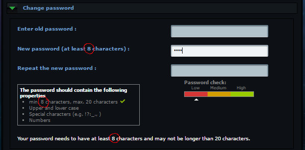
      [Polishing] The minimum password length is now 4 digits instead of 8
      I changed my password to another one with only 4 digits and it works. :)

      But here

      it still says "8" everywhere...


      The Board link not anymore hidden under the login field -> :thumbsup: :thumbsup:

      But somehow... I don't really know why, the button looks a bit strange to me... It might be the colour, I'm not sure...
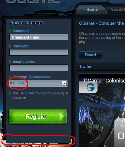


      I guess the red marked things are 'CSS issues', which are already reported!?


      € And I don't know the reason of changing the selection of the universe to the bottom, but to me it feels kind of wrong. If I register, I think the first and most important is where I want to register myself, so I would have left that on top... but well......

      The post was edited 1 time, last by Lunati ().

    • The loca parts are also known and will be changed, when the version goes live on all servers. If we change it now, also all EN servers will get the change (That´s the reason i got).

      For changing the Fields: It MAY feel wrong but it is not. The change will be done an nearly all gameforge games, so not on OGame alone (e.g. Ikariam.de already has that). As new User you want to have your nickname and at last you choose the server, where you want to play, or you just don´t care where you want to play. That is also the reason, why many other big browsergames want at first place the nickname and the place where you want to play at last.

      But yeah, every change feels strange at the first time. I have the version now since some weeks in test and it feels common to have it at bottom.

      Thx for feedback :)

      LG
      Being a QA is sort of like being a goal keeper. People only talk about you when you’ve screwed up. We are the silent guardians of game development, and they will never have to thank us.
    • JoKy wrote:

      As new User you want to have your nickname and at last you choose the server, where you want to play, or you just don´t care where you want to play.
      I think you should care where you want to play, because there are universes with different settings, which include different speeds, and not every speed is the right one for everybody, so this should be thought about at first.
      But this is only my opinion and apart of that it is only a little thing, which is not really important. I just don't see the advantage in doing the efforts for this change, but well... I'm not the expert... ^^


      If there is an update on the startpage, maybe this could be the perfect opportunity to add the missing universes (if there are any missing) on the list of distinctions of every country...!? ;)
    • One of the new things that this change to the login page brings is a bit of a problem.

      Now numbered universes (at least in Spain) are named "Universe 1" while before it was named "1. Universe".

      With the old way, one could easily do: click on nick place to write it, write nickname, press TAB key, write password, press TAB key, press "1" which would select the numbered universe, press TAB key, press ENTER key.

      Now with this change, we can't choose the numbered universe with just the number, because the new name puts the number at the end.

      Could this nitpicking be brought back to the older version which had the number before and made it easily accessible through keyboard?
    • Hmm it seems that it is wrong in a hand full coms. I will write a bug ticket and hand it over to the resp. department.

      Thx for the report :)

      LG
      Being a QA is sort of like being a goal keeper. People only talk about you when you’ve screwed up. We are the silent guardians of game development, and they will never have to thank us.