
Some users noted that the font color on the overview page isn't good readable. Here is an example with two moons:
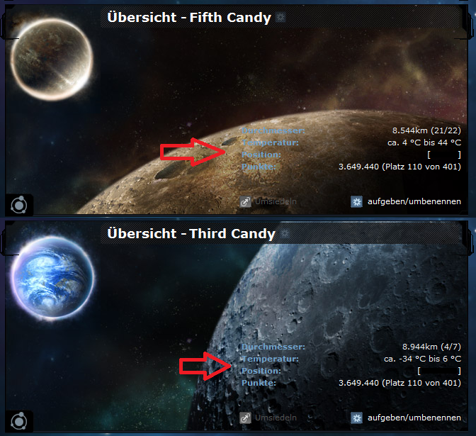
Maybe text shadow or a half transparent box behind the text would help.
See thread in ogame.de (german): board.ogame.de/board410-ogame-…iel/804857-schriftfarben/
Maybe text shadow or a half transparent box behind the text would help.
See thread in ogame.de (german): board.ogame.de/board410-ogame-…iel/804857-schriftfarben/
